Better Decisions Through Data.
. Its an example of data visualization for a network. #colors #color #colorful #pretty #tech #tree #data #visualization #internet #map Photo: Wikimedia/Matt Britt/The Opte Project/CC-BY-2.5")
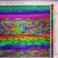
Moving on from dashboards & scoreboards, let’s look at some cool data visualizations. This is a 2005 visualization of the Internet IP addresses — or an Internet map. It’s an example of data visualization for a network. Each line joins two IP addresses, with the length representing the delay between them.
Less than 30% of reachable addresses were used to construct the Internet map, so this Internet map is only a partial map of the Internet at that time.
Photo: Wikimedia/Matt Britt/The Opte Project/CC-BY-2.5
A version of this article originally appeared as a photo post on our Instagram feed.


dig it
@rankexecutives Thx. See you’re in tech/internet. Any cool visualizations from your work to share?
I love it when you give me a like on instagram
Beautiful!