Better Decisions Through Data.

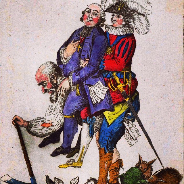
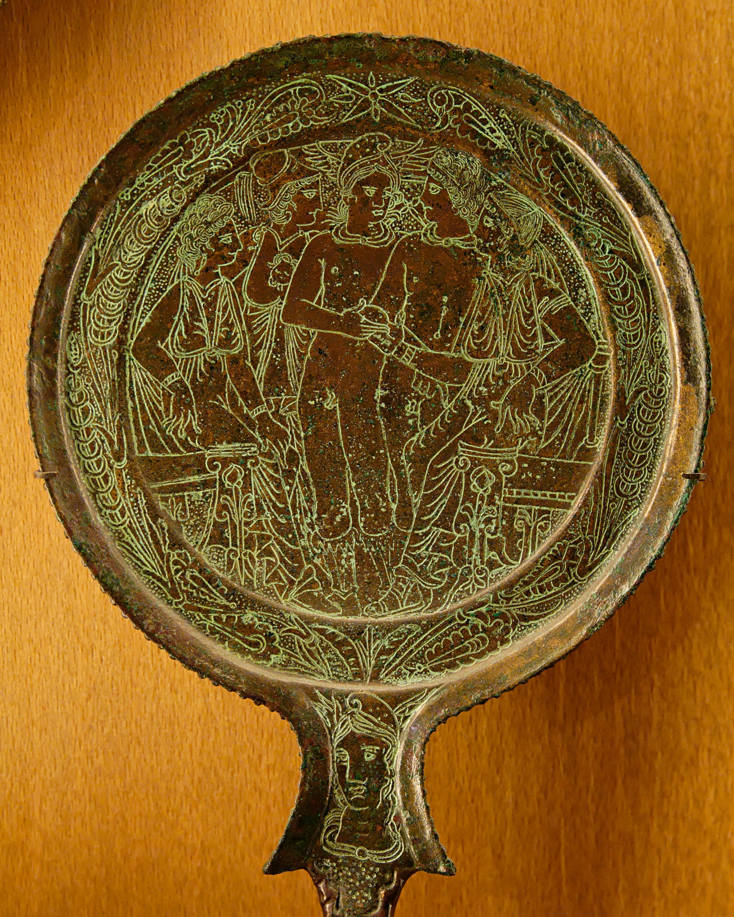
A collage we created to help visualize evolving historical notions of Earth over time. We created it as part of our IG data visualization series. The first two maps are from ancient Rome. The middle image is of a 16th-century map is already surprisingly accurate. (That map was the tanktop being worn by our virtual reality fashion model in our last collage.) The last image is Earth photographed from space. D
Data and geospatial analytics, where data is combined with other location information, are often important components in data analysis and visualizations. We have more and modern map collages forthcoming.
Post and some comments below may be synced from our original Instagram version.
Instagram likes: 60


There are no comments so far