Better Decisions Through Data.
Posts Tagged "colors"
There are 24 results found

Iconic Carl Sagan Nasa Pioneer plaque as glitch art
Ok, we took a pause from our variations on maps and charts to look back at some of the more iconic past images on our IG feed. One of our most iconic (and recognizable) is the Carl Sagan-designed plaque that went into space aboard Pioneer in the 1970s as a message to aliens. We had to crop the image to keep within IG community standards. (We also did a 3D-printed version of this.) So here is our first take on this: glitched Carl Sagan Pioneer Nasa plaque. If aliens would have a hard time deducing Earth’s location from the original Plaque due to the errors (see our original post and some of subsequent ones), this glitch art version would totally confuse them. If only we sent this version into space instead, Earth would now be safe from predatory aliens! 🙂 It’s also no longer #monochrome, due to the glitching skewing the colors.Ironically,… Read the rest
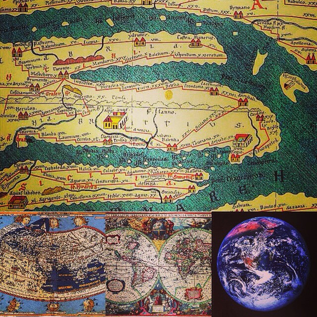
Evolution of historical notions of Earth
A collage we created to help visualize evolving historical notions of Earth over time. We created it as part of our IG data visualization series. The first two maps are from ancient Rome. The middle image is of a 16th-century map is already surprisingly accurate. (That map was the tanktop being worn by our virtual reality fashion model in our last collage.) The last image is Earth photographed from space. D Data and geospatial analytics, where data is combined with other location information, are often important components in data analysis and visualizations. We have more and modern map collages forthcoming. Post and some comments below may be synced from our original Instagram version. Instagram likes: (more…)… Read the rest
A Visualization of Wikipedia Data
In addition to the difficulty of efficiently storing and processing very large data sets, it is often difficult to come up with compelling visualizations of different database technologies in action. Continuing our recent series on data visualization images on IG, this is a visualization of daily Wikipedia edits activity by the Wikipedia bot script “Pearle” as done by IBM. It’s an excellent example of how to simultaneously visualize both a data process and a large data set. More info can be found in Proceedings of INTERACT (2007). “Visualizing Activity on Wikipedia with Chromograms”. The original data is several terrabytes in size. So this is “big data” in 2015. And it should stay “big data” at least for a while, until the equivalent of Moore’s law for data storage makes it small data in a few decades or so. 🙂 Photo credit: Wikimedia/Fernanda B. Viégas/CC-BY-2.0 Post and some comments below may be synced from our original Instagram version.… Read the rest