Better Decisions Through Data.
Posts Tagged "graphic"
There are 6 results found

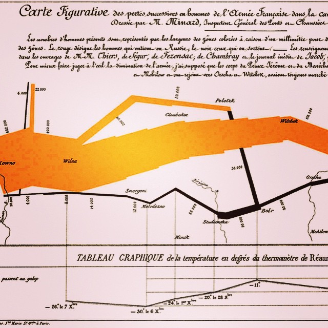
Satire and satirical drawings in 1789 could get you killed
Satirical drawing from 1789. We started off this series (on our IG) of French Revolution postings with a United Nations graphic on current inequality (or an inequality-adjusted Human Development Index.) We wanted to help illustrate why some current theory says it’s important. Historians debate the causes of the revolution, but commentators at the time pointed out inequality. This is one of the social commentators arguing the social inequality aspect, but doing so with a cartoon rather than words. (The 3rd estate is carrying the wealthy 1st and 2nd estates on its back. The 3rd estate were the commoners in the French ancient regime. Amongst other things, they were subject to much heavier taxation than the other two estates.) Then, as now, these cartoons could get you in trouble. This was 18th century drawing was published anonymously. If it annoyed the King too much, the 18th century police would launch an investigation to trace the source.… Read the rest
Asteroids hit the Earth more often than thought
As show in this map, small space asteroids hit the Earth more often than commonly thought. We’re continuing our recent asteroid theme. According to this map, small asteroids were documented hitting the earth 556 times in the twenty year from 1994 to 32013. Nasa notes that “almost all were harmless.” Ahhh, well, almost all, except for that Chelyabinsk event. (The study of these unlikely but potentially catastrophic “Black Swan” events, like the Carrington Event, is another topic we’ve discussed before (here).) Recall the Chelyabinsk event broke a lot of windows and caused a lot of other damage in rural Siberia (and made for some pretty spectacular video). Good thing Siberia is rural, because the Chelyabinsk event _only_ released 20-30 times more energy than the atomic bomb over Hiroshima. And it wasn’t detected before it entered Earth’s atmosphere. So maybe that early warning system needs some work if we want to continue feeling smug and so much superior to the dinosaurs.… Read the rest
Wolfram mathematica: data visualization example
This is example of visualization using Wolfram Mathematica, a commercial software package. We’ve previously discussed some of Wolfram’s other products and ideas in an earlier post on digital physics and cosmology as well as in our posts on IBM Watson. One of the reasons that data visualization remains something of a black art is that there are so many data visualization packages out there. Each package has its strength in a few kinds of plots or types of visualizations. Some of the better packages are commercial (and, unfortunately, not necessarily inexpensive). The high prices mean the experience of any practitioner is likely to be limited to a few commercial visualization packages over the course of a career (since most sites will only license a few packages). Open source data visualization packages are therefore very powerful, since they potentially combine the best of free tools. There are very good free tools out there.… Read the rest