As show in this map, small space asteroids hit the Earth more often than commonly thought. We’re continuing our recent asteroid theme. According to this map, small asteroids were documented hitting the earth 556 times in the twenty year from 1994 to 32013. Nasa notes that “almost all were harmless.” Ahhh, well, almost all, except for that Chelyabinsk event. (The study of these unlikely but potentially catastrophic “Black Swan” events, like the Carrington Event, is another topic we’ve discussed before (here).) Recall the Chelyabinsk event broke a lot of windows and caused a lot of other damage in rural Siberia (and made for some pretty spectacular video). Good thing Siberia is rural, because the Chelyabinsk event _only_ released 20-30 times more energy than the atomic bomb over Hiroshima. And it wasn’t detected before it entered Earth’s atmosphere. So maybe that early warning system needs some work if we want to continue feeling smug and so much superior to the dinosaurs.… Read the rest
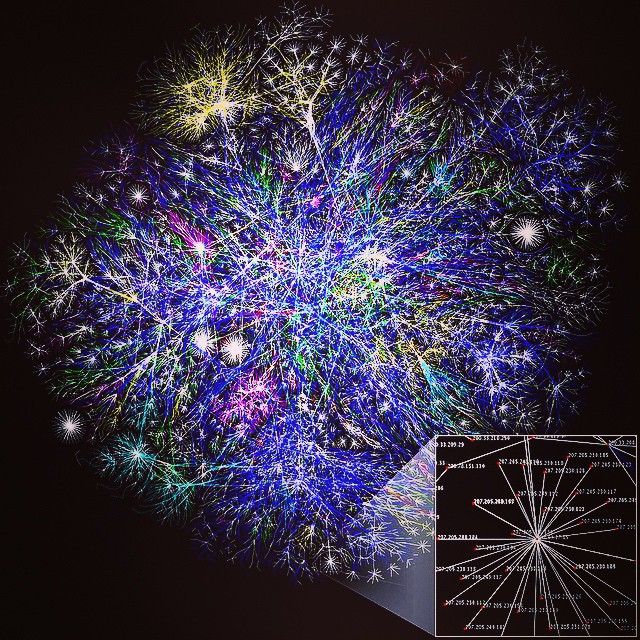
In addition to the difficulty of efficiently storing and processing very large data sets, it is often difficult to come up with compelling visualizations of different database technologies in action. Continuing our recent series on data visualization images on IG, this is a visualization of daily Wikipedia edits activity by the Wikipedia bot script “Pearle” as done by IBM. It’s an excellent example of how to simultaneously visualize both a data process and a large data set. More info can be found in Proceedings of INTERACT (2007). “Visualizing Activity on Wikipedia with Chromograms”. The original data is several terrabytes in size. So this is “big data” in 2015. And it should stay “big data” at least for a while, until the equivalent of Moore’s law for data storage makes it small data in a few decades or so. 🙂 Photo credit: Wikimedia/Fernanda B. Viégas/CC-BY-2.0 Post and some comments below may be synced from our original Instagram version.… Read the rest