Better Decisions Through Data.
. \"Visualizing Activity on Wikipedia with Chromograms\". The data is several terrabytes in size. So this is \"big data.\" At least for a while, until the equivalent of Moore's law for data storage makes it small data in a few decades or so. :) data Photo: Wikimedia/Fernanda B. Viégas/CC-BY-2.0")
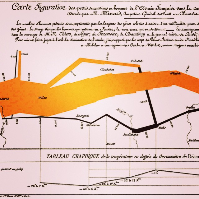
In addition to the difficulty of efficiently storing and processing very large data sets, it is often difficult to come up with compelling visualizations of different database technologies in action. Continuing our recent series on data visualization images on IG, this is a visualization of daily Wikipedia edits activity by the Wikipedia bot script “Pearle” as done by IBM. It’s an excellent example of how to simultaneously visualize both a data process and a large data set. More info can be found in Proceedings of INTERACT (2007). “Visualizing Activity on Wikipedia with Chromograms”. The original data is several terrabytes in size. So this is “big data” in 2015. And it should stay “big data” at least for a while, until the equivalent of Moore’s law for data storage makes it small data in a few decades or so. 🙂
Photo credit: Wikimedia/Fernanda B. Viégas/CC-BY-2.0
Post and some comments below may be synced from our original Instagram version.
Instagram likes: 66


Cool data visualization. How would you do a visualization like this in R or scientific python?