Better Decisions Through Data.
Posts Tagged "color"
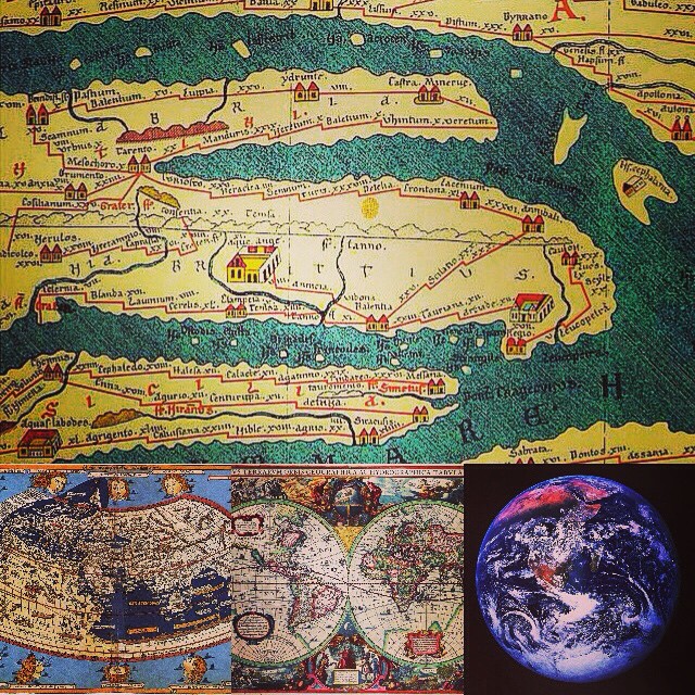
There are 6 results found

Wolfram mathematica: data visualization example
This is example of visualization using Wolfram Mathematica, a commercial software package. We’ve previously discussed some of Wolfram’s other products and ideas in an earlier post on digital physics and cosmology as well as in our posts on IBM Watson. One of the reasons that data visualization remains something of a black art is that there are so many data visualization packages out there. Each package has its strength in a few kinds of plots or types of visualizations. Some of the better packages are commercial (and, unfortunately, not necessarily inexpensive). The high prices mean the experience of any practitioner is likely to be limited to a few commercial visualization packages over the course of a career (since most sites will only license a few packages). Open source data visualization packages are therefore very powerful, since they potentially combine the best of free tools. There are very good free tools out there.… Read the rest
Multicolor 3D scatterplot: traditional data visualization
Traditional data visualization: this is a multicolor scatterplot done at LLNL (Lawrence Livermore National Labs) near Berkeley, CA using the free, open source software package they developed (VisIT). VisIt can perform various transformations to attempt to visualize multi-dimensional data, including phase-space renderings and applying glyphs to show higher dimensions. The 3D scatterplot visualization here seems to be a more traditional 3D scatterplot, with color used to visualize a fourth dimension of data. (There are visualization techniques to attempt to show more than four dimensions, although your results may vary. Our earlier post showing a streamgraph shows one of these methods, although there are more. Conveying complex information in a meaningful way using tools like a multicolor 3D scatterplot is as much art as science, as you can see.) A version of this article originally appeared as a photo post on our Instagram feed. (more…)… Read the rest
Napoleon in Russia: Classic 19th Century Infographic
This is an amazing, classic 1869 French infographic and data visualization on Napoleon’s disastrous 1812-13 Russia campaign. Although it does not entirely fit into an Instagram square (this was originally published on IG), the very thick line in color is the Emperor of France’s army arriving. The extremely thin black lines are the surviving retreating troops staggering back home from Moscow. Frost bite and the bitter Russian winter were a major factor contributing to the heavy losses. (The temperature is shown in the bottom of the chart in Celsius, and you can see the impact of lower temperatures on the thinning black line. Had wind chills been understood in 1869, an even more dramatic correlation might have been possible.) This infographic is successful because it succinctly captures a great deal of information into a single figure. In addition to showing Napoleon’s dwindling troop strengths at various points in the campaign, a rough sense of chronology, geography (town names) and troop movements is given, together with the environmental conditions that contributed to the disaster. … Read the rest